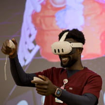
Ryan Sleeper features titles like Iron Viz Champion and Zen Master on his resume, which may lead you to think he’s an athletic competitor. Sleeper is a competitor, but he won the titles with his brain, hands and computer.
Sleeper is a data visualization designer, author, speaker and consultant who specializes in Tableau, a software analytics tool. CHA engaged with Sleeper while incorporating Tableau into its analytic solutions, including Pediatric Health Information System (PHIS), to help participants better visualize the data.
Why is data visualization more productive?
Humans are not good at reading a million-row spreadsheet. But when you convert those million rows into a bar chart, we can read it almost instantly. We’re good at processing colors, lengths of bars and different shapes. We are so good at recognizing differences, we can process them subconsciously.
Why doesn’t everyone convey data visually?
My theory for why people are not able to make the leap from the text table is because they don’t have enough trust in the raw data. Their entire career they’ve seen the exact numbers and have more trust with that. When you visualize data, you lose the exact number because it becomes part of the visual. As an analyst, it’s our responsibility to build trust. You must trust the analyst and believe the raw data is accurate before you’re going to trust what he or she is showing you and then potentially act.
What are the keys to starting a new project?
Any time I build data visualization, I ask two questions, “Who is the audience for this?” and “What is the measurement of success?” The first question is important because data visualization is not a one-size-fits-all approach. I want to learn what aspects of the data they understand—are there visuals they really like or don’t like? If a leader has only been using spreadsheets for his or her entire career, I can’t have a complex dashboard, or I’ll lose the audience.
For the second question, I often challenge a company to figure out what its really trying to achieve and create a tangible goal. An example might be to improve customer satisfaction by 20% by next year. A specific objective with a time frame often leads to a better chance of improving the business.
What’s the biggest lesson you’ve learned throughout your career?
I’ve learned to present to leadership with both formats side-by-side. If leadership has the raw, text table mentality, I encourage you to present the visual with raw data. They’ll find insights faster and insights will be more accurate. People kind of have an epiphany. When I show them the highlight table versus the text table example, they go, “Wow. You’re right,” and they’re converted.


